
Blackfoot Confederacy
Honouring Tradition. Elevating Presence.
The Blackfoot Confederacy unites four Nations—Siksika, Kainai, Piikani, and Amskapi Piikani—across Alberta and Montana. As descendants of terraformers, Land Keepers, and storytellers, their vision continues to honour the past while building for the future. Our role was to help elevate this presence with a brand and digital foundation as powerful and meaningful as the Confederacy itself.
The Challenge
While the Confederacy’s emblem carried deep cultural meaning, it lacked consistency and versatility across modern platforms. The logo needed refinement—something that could retain every ounce of its symbolism while improving legibility, cohesion, and impact.
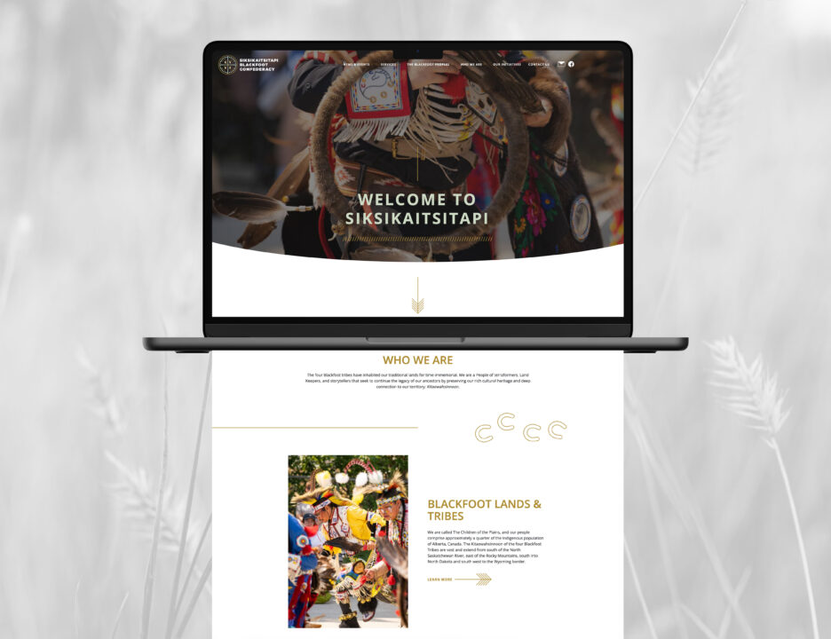
Additionally, the Confederacy needed a website that could serve as a central resource for information, updates, and advocacy—accessible to community members, partners, and the wider public.
The Solution
We respectfully refined the existing logo to enhance clarity, balance, and versatility. The updated mark retains the core structure and symbolism—four tipis, circle of unity, directional markers—but is now rendered with precision and purpose. Earth-toned golds, browns, and deep greens ground the identity in the land itself.
To support broader communications, we developed a secondary colour palette—subtle, earthy, and adaptable across digital and print applications.
We also designed and launched a modern, responsive website for the Blackfoot Confederacy. Key features include:
- A welcoming, image-rich homepage honouring Blackfoot culture and territory
- Clearly organized sections to share leadership, initiatives, events, and history
- A warm, respectful tone of voice grounded in cultural language and values
- A mobile-first experience for easy access across devices
The visual and verbal identity are aligned across platforms, giving the Confederacy the consistency and credibility their leadership deserves.
Every element was crafted to reflect the development’s tone: elevated, tranquil, and intentional. Natural textures, subtle metallic finishes, and thoughtful copy all worked together to create a sense of presence and place.
The Result
The new brand system and website have created a stronger, more unified presence for the Blackfoot Confederacy. Whether viewed by community members or national partners, the visual identity now communicates what the Confederacy has always embodied: strength, sovereignty, and deep cultural continuity.
From the updated emblem to the language used online, every element is a reflection of Kitaowahsinnoon—the Blackfoot ancestral territory, and the legacy they continue to protect.
Brandsmith
CLIENT:
Blackfoot Confederacy
YEAR:
2023-2024
PROJECT: